THE GINI COEFFICIENT.
The Gini Coefficient is derived from the same information used to create a Lorenz Curve - the distribution of income in an economy.
The Gini Coefficient can take values from 0 to 100 per cent or from 0 to 1 where a value of zero would indicate that each household had an equal share of income, while higher values indicate greater inequality.
The chart below shows the trend in the Gini Coefficient for original and disposable incomes of NZ households since the 1980’s. Inequality of disposable income was fairly low in the first half of the 1980s then increased during the second half of the 1980s. Inequality continued to increase during the1990s and started to decline in the early 2000’s. AHC stands for After Housing Costs and is a more accurate measure of income inequality.
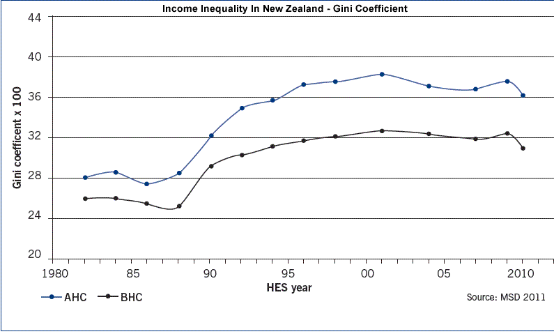 |
Why did Inequality increase during the late 80's and 90's? There was a movement towards free market economics, with a decrease in taxes, introduction of GST ,welfare reforms (lowering of benefits). This lead to some sections of society being able to benefit from these changes, while others become worse off. In the early 2000's, the government introduced the working for families package which helped lower to mid income working families with children, by providing assistance according to their income and the number of children they have. The recession from 2007 to 2010 impacted on higher income households more and so inequality again decreased during this time. |
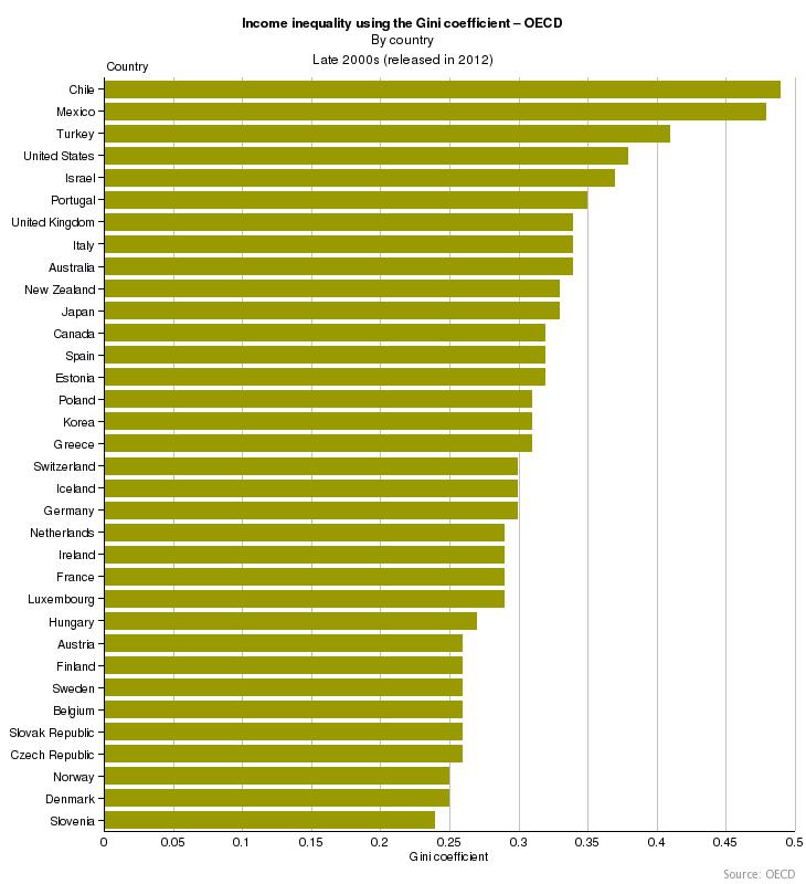 |
Gini Coefficient in the World. The diagram on the left shows that Chile is the most unequal with a Gini Coefficient of 0.47 or 47%, compared to New Zealand's 0.33 or 33%. The most evenly distributed income in the world is in Slovenia, with an index of 24% (0.24).
|